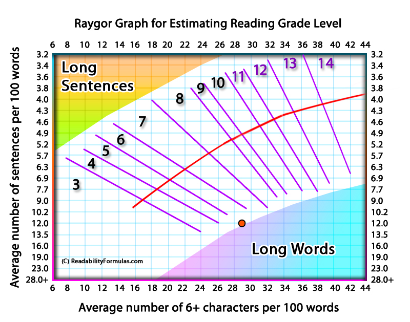
The Raygor Graph is a formula/graph developed by Alton L. Raygor in the 1970s to score the readability of English prose. The graph is a two-dimensional plot, represented on a grid. The x-axis is the number of words with six or more letters, while the y-axis is the number of sentences.
The graph is divided into sections, each spanning a grade level. The sections are marked by lines, which are drawn based on text analysis and their grade levels. The point at which the lines intersect reveals the grade level.
Here’s how to use the Raygor Graph:
- Select a Passage: Select the text you want to score.
- Count Sentences: Count the number of sentences in the passage. A sentence is defined as any group of words ending with a period, question mark, or exclamation point.
- Count Long Words: Count the number of words in the passage that have six or more letters.
- Plot the Counts: Plot the number of sentences (y-axis) against the number of long words (x-axis). The point at which these two lines intersect will indicate the grade level.
The grade level corresponds to the U.S. education system—a grade level of 8 means the text is suitable for an eighth-grade student or higher. The graph ranges from Grade 1 to Grade 14 (which corresponds to postgraduate level).
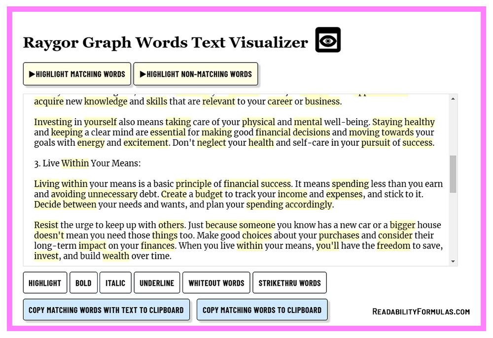
The Raygor Graph analyzes words with six or more letters as a measure of vocabulary difficulty. Longer words are generally more complex and less familiar to younger or less experienced readers. Here’s why Alton Raygor decided on this metric instead of syllable count:
1. Longer Words Are More Complex
Many words with six or more letters are derived from Latin or Greek roots, which are often more abstract and difficult to understand. Shorter words (1-5 letters) are usually high-frequency, everyday sight words (e.g., run, big, cat, jump), whereas longer words (e.g., suddenly, information, establish) require a broader vocabulary.
2. Correlation with Word Familiarity
Research on how readers learn new vocabulary shows that frequent exposure to shorter words happens earlier in the reader’s development, whereas longer words are learned later. This makes six-letter words a balanced threshold to estimate whether a text is appropriate for high school and college students.
3. Connection to Cognitive Load
Longer words often contain more syllables, forcing readers to use more cognitive effort to decode. Such words are less common in everyday dialogue, which increases reading difficulty for younger or low-level readers.
4. Readability Formula Consistency
Other readability formulas also associate longer words with higher reading difficulty:
- Flesch-Kincaid: Uses syllables per word.
- Dale-Chall: Uses unfamiliar words that are typically longer.
- Gunning Fog Index: Counts words with three or more syllables.
- SMOG Index: Counts polysyllabic words.
Raygor simplifies this with the six-letter threshold. Word length is a straightforward and consistent measurement.
When you use the Raygor Graph, keep in mind:
- Sampling: Select the passage to represent the entire text accurately. If the text is long, you can extract several samples and average them.
- Word Count: The graph emphasizes words with six or more letters. This focus can introduce biases; for example, technical texts with long words may rate higher, even if they have simple sentences.
- Sentence Length: The graph factors in the number of sentences. Shorter sentences are easier to read, but that isn’t always true.
- Limitations: Unlike other formulas, Raygor doesn’t factor in semantic complexity, cohesion, text layout, or reader interest, all of which can affect readability.
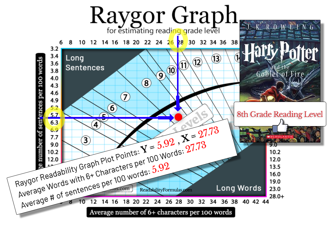
The Raygor Graph scored Harry Potter and the Goblet of Fire (J. K. Rowling) at an 8th-grade reading level, which is the reading level validated by teachers and literary specialists. You can see the results below.
Raygor Graph vs. the Fry Graph
The Fry Graph and the Raygor Graph are similar tools to score text readability visually on a graph, but they differ slightly in calculations.
| Criteria | Fry Graph | Raygor Graph |
|---|---|---|
| Origin | Developed by Dr. Edward Fry in the 1960s. | Developed by Dr. Alton Raygor in the 1970s. |
| Method | Uses average sentences per 100 words and average syllables per 100 words. | Uses average sentences per passage and average syllables per word. |
| Graph Plots | Plots average number of sentences against average syllables (both per 100 words). | Plots average number of sentences per passage against average syllables per word. |
| Readability Levels | Covers 1st to 16th grade. | Graph may vary but serves a similar purpose to output a grade level. |
| Sample Size | Any size | Any size |
Applications of the Raygor Graph
The Raygor Graph—it’s a tool that sneaks into many industries, from education to healthcare, like the Swiss Army knife of readability graphs. Because who wouldn’t want to plot their way to better reading comprehension?
| Industry | Uses of the Raygor Graph | What It Does |
|---|---|---|
| Education | Matching Grades | Helps teachers match books to their students’ reading levels. This helps students score higher on tests. |
| Building Curriculum | Book publishers use the graph to ensure textbooks are not too easy or too hard. | |
| Helping Struggling Readers | Used to create reading help programs. About 21% of U.S. adults read below a 6th-grade level, so this is important. | |
| Publishing Industry | Matching the Audience | Publishers use the Raygor Graph to make sure their books are easy to understand. |
| Improving Writing | Writers use the graph to cut extra words and make their text shorter and easier to read. | |
| Marketing Choices | Helps decide if a book is for teens or for a smaller group who like more difficult reading. | |
| Healthcare | Patient Information | Doctors use the graph to make papers easier to read, so patients understand their health and follow instructions. |
| Talking to Patients | Helps doctors explain things in simple language to build trust with patients. | |
| Checking Health Knowledge | Used to check how much people know about health so doctors can make programs easier to understand. | |
| Government and Legal Fields | Legal Forms | Helps make legal papers easier for people to understand, so they don’t get confused. |
| Government Communication | Helps write clear messages and notices that everyone can understand. | |
| Business and Marketing | Product Guides | Makes sure manuals are easy to read, so customers don’t return products because of confusing instructions. |
| Advertising | Helps write simple and clear ads, which can increase how many people pay attention to them. |
The Raygor Graph has diverse uses across various fields, from education to healthcare to business. It serves as a helpful tool for making texts accessible and engaging to specific audiences.
You can use ReadabilityFormulas.com’s free Raygor Graph Calculator to analyze your text and automatically plot the results on the graph.
Scott, Brian. “Learn about the Raygor Readability Graph.” ReadabilityFormulas.com, 24 Feb. 2025, https://readabilityformulas.com/the-raygor-readability-graph/.


